Tuesday, 16 April 2013
Saturday, 13 April 2013
Thursday, 11 April 2013
Wednesday, 10 April 2013
Tuesday, 9 April 2013
Evaluation Task 2;
How does your media product represent
particular social groups?
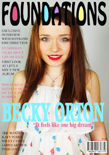
My magazine represents the particular social group, pop. I’ve made
and designed my magazine to fit in with the genre of pop, by using band names
like “One Direction” and “Little Mix” on the front cover, and also by dressing
my artist like a pop star, not a rock artist, and having the colour scheme
pretty and pink. My magazine is very similar to Billboard and Seventeen, which
are both US magazines, as both of these magazines are the same type of music my
magazine is based on. I’ve used the colours, pink, baby blue and black for the
writing, because the colour pink is very girly which is the type of social
group my magazine is based at. My artist of the front is a young girl, dressed
in pretty dress, which is very stereotypical because young pop artist are
usually known to were that type of thing. She’s wearing her hair down (I used a
model with long hair because the artist who Inspired me Carly Rae Jepson had
long hair) with natural make up, but red lipstick. This fits well with the
genre of my magazine.
I think I’ve represented my artist positively on the front cover, as she looks
like the perfect role model for young girls who would be interested in her
music.
There are a couple of similarities and differences between the two magazines; Similarities; they’re both wearing bright red lipstick, which stands out and is a bright colour. Although their clothing is different they’re both dressed like pop artists. They both have long hair, which is below their shoulders. Both use bright colours, which stand out and are bright. Both F models. The title is at the top of the page.
Differences; Carly Rae Jepson is
angled differently and has a shot from her hips up, whereas Yazmine is angled
straight on from the chest up. IBSN is on the right for mine and is on the left
for billboards.
particular social group would speak and act and said the type
of stuff young girls would want to hear.
Saturday, 30 March 2013
Thursday, 21 March 2013
Wednesday, 20 March 2013
Tuesday, 19 March 2013
Monday, 18 March 2013
Photoshopping & Discussions;
As I have photoshop at home I did a lot of photoshopping at home to make my artist look flawless because of the cover of most pop magazine the artist looks flawless and I wanted mine to look the same. I used the blemish tool to touch up any bits that needed doing, and the spot removal brush over a couple of parts. I also used the light tool to make the background and my photo to look a little lighter and this also helped get ride of any dark shadows. I then used different tools to get ride of any fly-away hair on the pictures. I spent hours cropping out different pictures and placing them in different places on the contents page to see which one looked better, in the end I decided on two different photos for both my front cover and contents page. I spent a lot of time choosing different fonts and colours to see which looks better with which colour and which stood out better, in the end I decided on a final font "Times" which i used a lot throughout the whole magazine.
I originally wanted to keep my front cover roughly the same to my draft magazine as I really liked the photo of the front cover, however Mr Smith thought that my artist needed to look more poppy and her clothes didn't suit the genre of my magazine. I felt that it would be a lot easier to use that photo as my front cover, because its one all of the teachers originally liked and so did I. Also because after doing another photo shoot where I didn't get any ideal photos for the front cover, I thought it was the easier option. Then I did some more pictures which Mr Smith thought she was dressed more like a pop artist, however her hair was different than before which shaped her head differently. I picked out two different dresses, a white flowery one and a dark purple one, and then a crop top and some high waisted shorts. I then took some more photos, and after asking several different people me and Mr Smith decided on two different photos for my front cover.
I originally wanted to keep my front cover roughly the same to my draft magazine as I really liked the photo of the front cover, however Mr Smith thought that my artist needed to look more poppy and her clothes didn't suit the genre of my magazine. I felt that it would be a lot easier to use that photo as my front cover, because its one all of the teachers originally liked and so did I. Also because after doing another photo shoot where I didn't get any ideal photos for the front cover, I thought it was the easier option. Then I did some more pictures which Mr Smith thought she was dressed more like a pop artist, however her hair was different than before which shaped her head differently. I picked out two different dresses, a white flowery one and a dark purple one, and then a crop top and some high waisted shorts. I then took some more photos, and after asking several different people me and Mr Smith decided on two different photos for my front cover.
Evaluation Task;
For the final 20 marks of the project, you must complete seven tasks on your blog, posting them in this order, with the question heading at the top of each task. Make sure you answer each question as well as producing the visual elements. Try not to write more than 1500 words in total.
1. In what ways does your media product use, develop or challenge forms and conventions of real media products? (i.e. of music magazines)
2. How does your media product represent particular social groups ?
3. What kind of media institution might distribute your media product and why?
4. Who would be the audience for your media product?
5. How did you attract/address your audience?
6. What have you learnt about technologies from the process of constructing this product?
7. Looking back at your preliminary task (the continuity editing task), what do you feel you have learnt in the progression from it to full product?
Friday, 15 March 2013
.tiff)
.tiff)


Week 8
week 8;
FINAL WEEK.
I took some more photos because I wasn't too sure with my last photo shoot I did. I finished my article and made some final tweaks to my magazine. I couldn't decide between 5 different magazine covers, and a couple of photos for my contents page.
FINAL WEEK.
I took some more photos because I wasn't too sure with my last photo shoot I did. I finished my article and made some final tweaks to my magazine. I couldn't decide between 5 different magazine covers, and a couple of photos for my contents page.
Thursday, 14 March 2013
Front Cover font and colour ideas


I tried different colours for the writing on the front cover; I found that yellow didn't work as you can see the writing, purple works but it looks quite dull and pink works the best.
Front Cover final Ideas
Front Covers;
These photos are taken from my second and third photo shoot. As i wasn't sure about which photos I preferred, I choose the five best photos and asked on different peoples opinions.

3 people said this one.

1 for this one.

5 people said this one.
None.

None.
Tuesday, 12 March 2013
Third Photo Shoot


fayekathryn's photostream on Flickr.
3rd photo shotI re-took the photos for a third time, because I felt that the 2nd photo shot I did, none of the photos worked on the front cover or the contents page. As I liked my original front cover photo, I tried to reanact the same pose. I also liked a photo from a contents page from billboard magazine, which I tried to to do as well.
Monday, 4 March 2013
Week 7
I've changed my initial idea for my contents page as before I didn't even have a layout for it, but now I've decided on one from the magazine billboard.
I also took some more photos this week, I choose three different outfits for her to wear;
I thought that these outfits were more "poppy" and suited the genre of my magazine as before she was styled like a pop artist.
I also made more tweaks to my final magazine.
Wednesday, 27 February 2013
Second Photo Shoot


fayekathryn's photostream on Flickr.
2nd Photo Shot I re-took my photos as I needed to dress my artist up more to the genre of my magazine which is pop. I dress Yazmine in two different dresses, a dark purple one, a white flowery one which you'd wear in the summer, and a crop top which some high waisted shorts. I think the outfit makes a lot of a difference, as now she looks more like a pop star.
Subscribe to:
Comments (Atom)